Tools used
Sketch Book
Miro
Illustrator
Lottie
Figma
Role
Product Design
User Research
Creative Direction
Product Strategy
Timeline
3 Months
PROJECT OVERVIEW
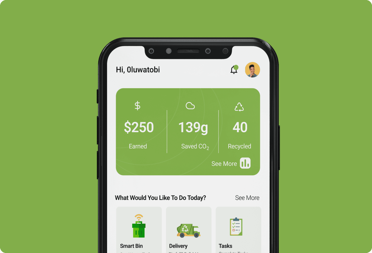
What is Ocula’s Boost ?
Ocula Boost helps eCommerce teams transform their customer experience, driving conversion up and costs down. The advanced software scans every online page, analysing against best in class and competitors. It then provides clear recommendations about the actions to take and pages to focus on, effortlessly driving conversion rate >20% . Example actions include powerful auto-generated product titles, descriptions and image alt tags. Set up takes just five minutes with no IT involvement required.
Problem
Ocula Boost provides actionable recommendations to eCommerce teams, but users faced uncertainty during interactions such as uploading data or implementing changes. This gap in feedback led to confusion, delayed actions, and reduced confidence in the product's efficiency.
Goals
Boost User Confidence: Create clear and timely feedback to keep users informed and assured during their interactions with Ocula Boost.
Enhance Efficiency: Streamline workflows with intuitive feedback to reduce errors and improve task completion rates.
USER RESEARCH
Designing for Precision
To address user uncertainties in Ocula Boost, I analysed potential feedback scenarios across four key error levels: app, page, component, and action. For each level, I crafted detailed user flows and journey maps, ensuring feedback was contextually appropriate and actionable. This approach provided a comprehensive framework for delivering precise feedback at the right moment, empowering users to navigate and resolve issues effortlessly.
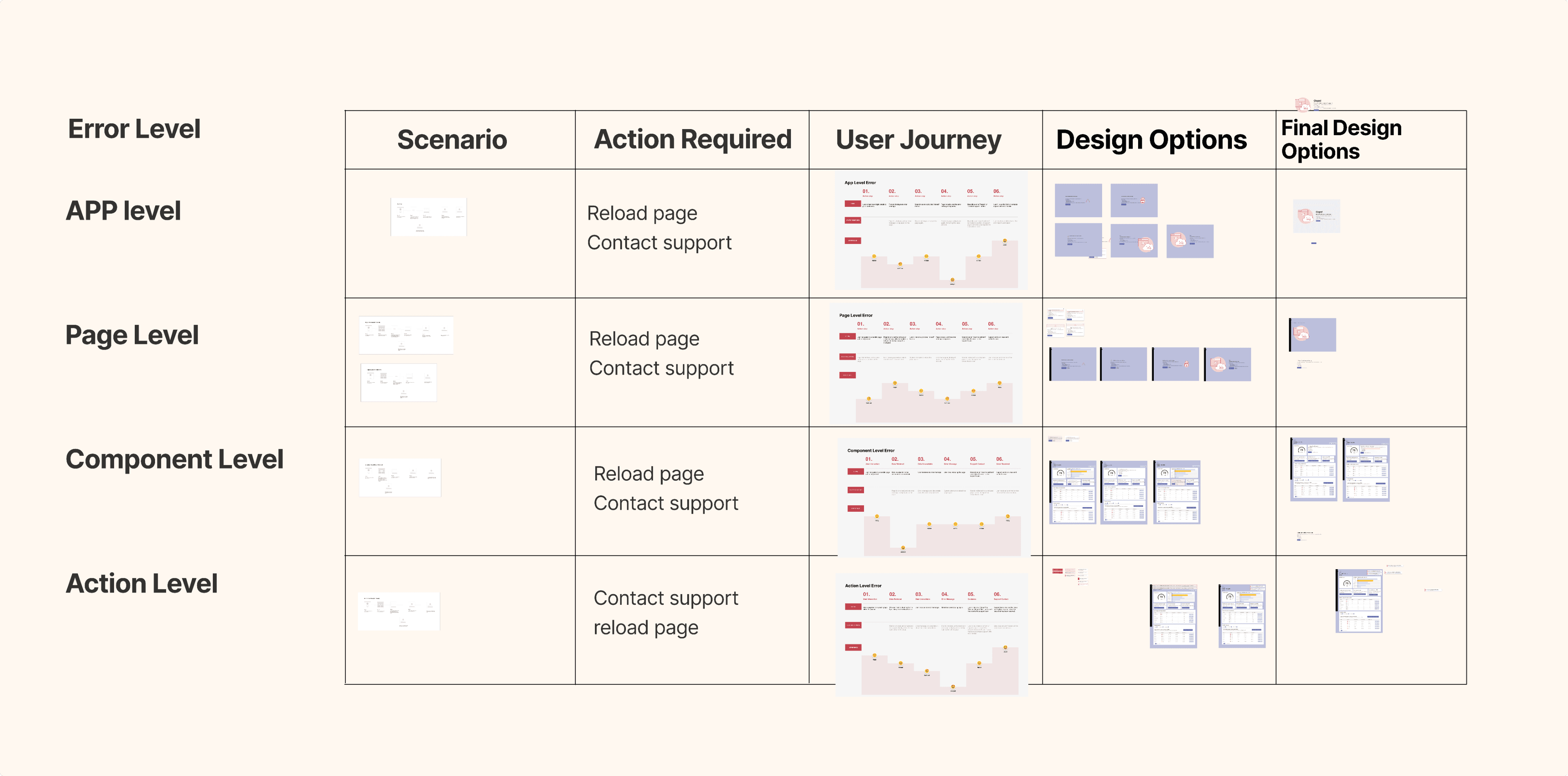
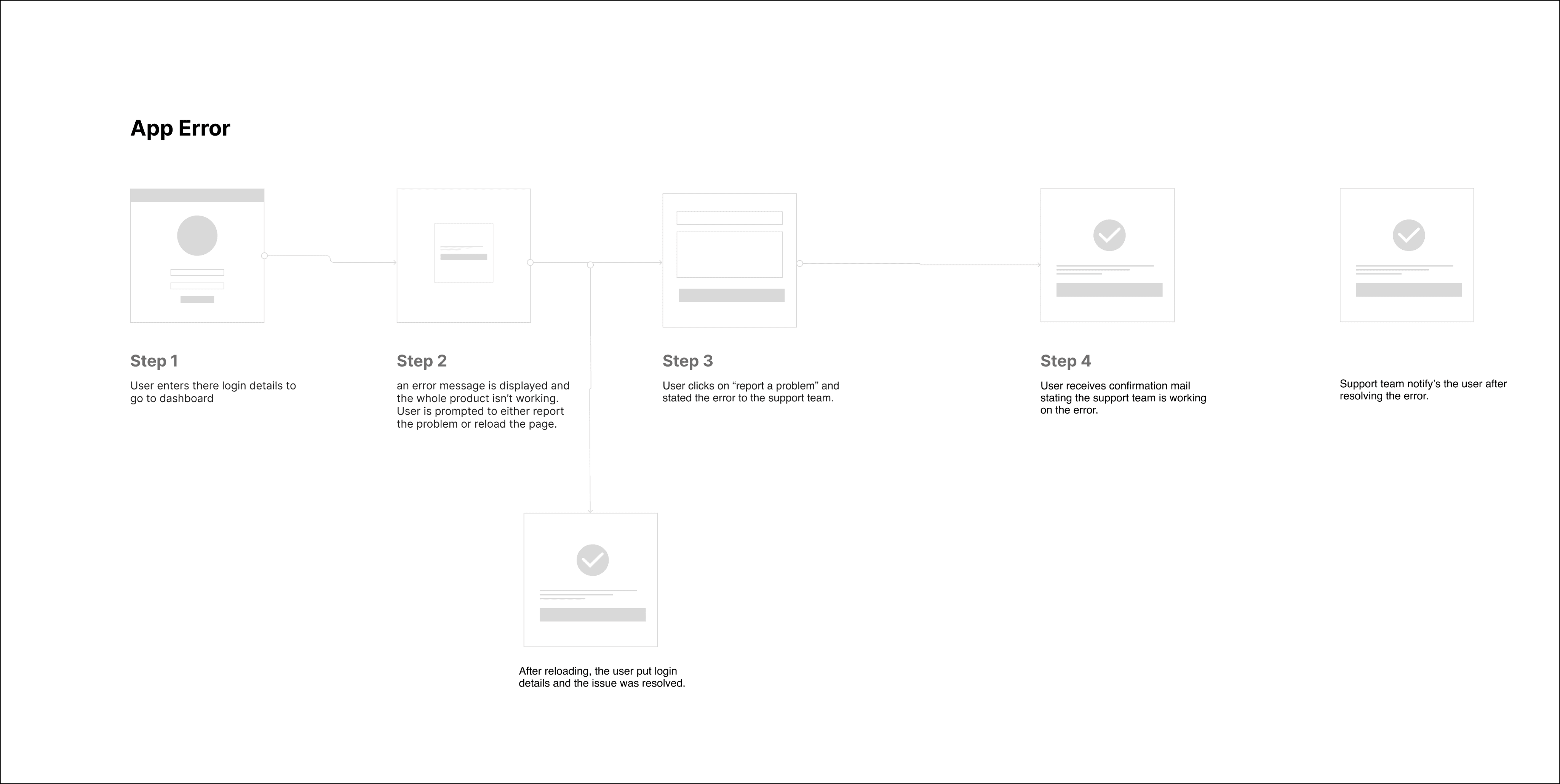
Designing for App-Level Errors
At the app level, errors like 404 pages can disrupt the user experience and erode trust. I designed user journeys to guide users seamlessly through these moments, incorporating elements like clear error messaging, navigation shortcuts, and helpful links.
The goal was to turn potential dead-ends into opportunities for recovery, ensuring users could quickly get back on track without frustration.

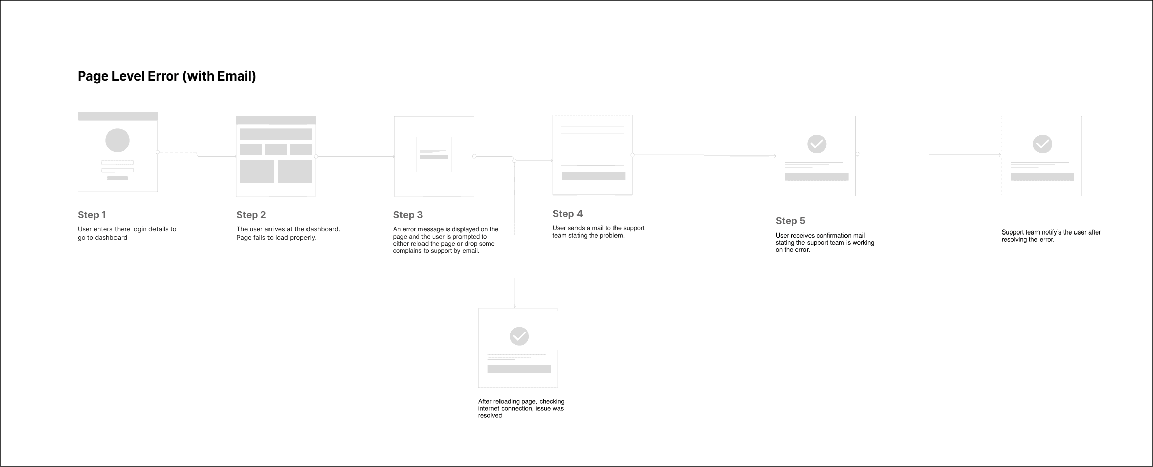
Page-Level Error
To address dashboard load failures, I designed error models with clear recovery paths. For email-based errors, users could contact support and receive updates on issue resolution. For form-based errors, users submitted reports through an intuitive form with instant confirmation. Both approaches ensured clear communication and empowered users to resolve issues quickly.


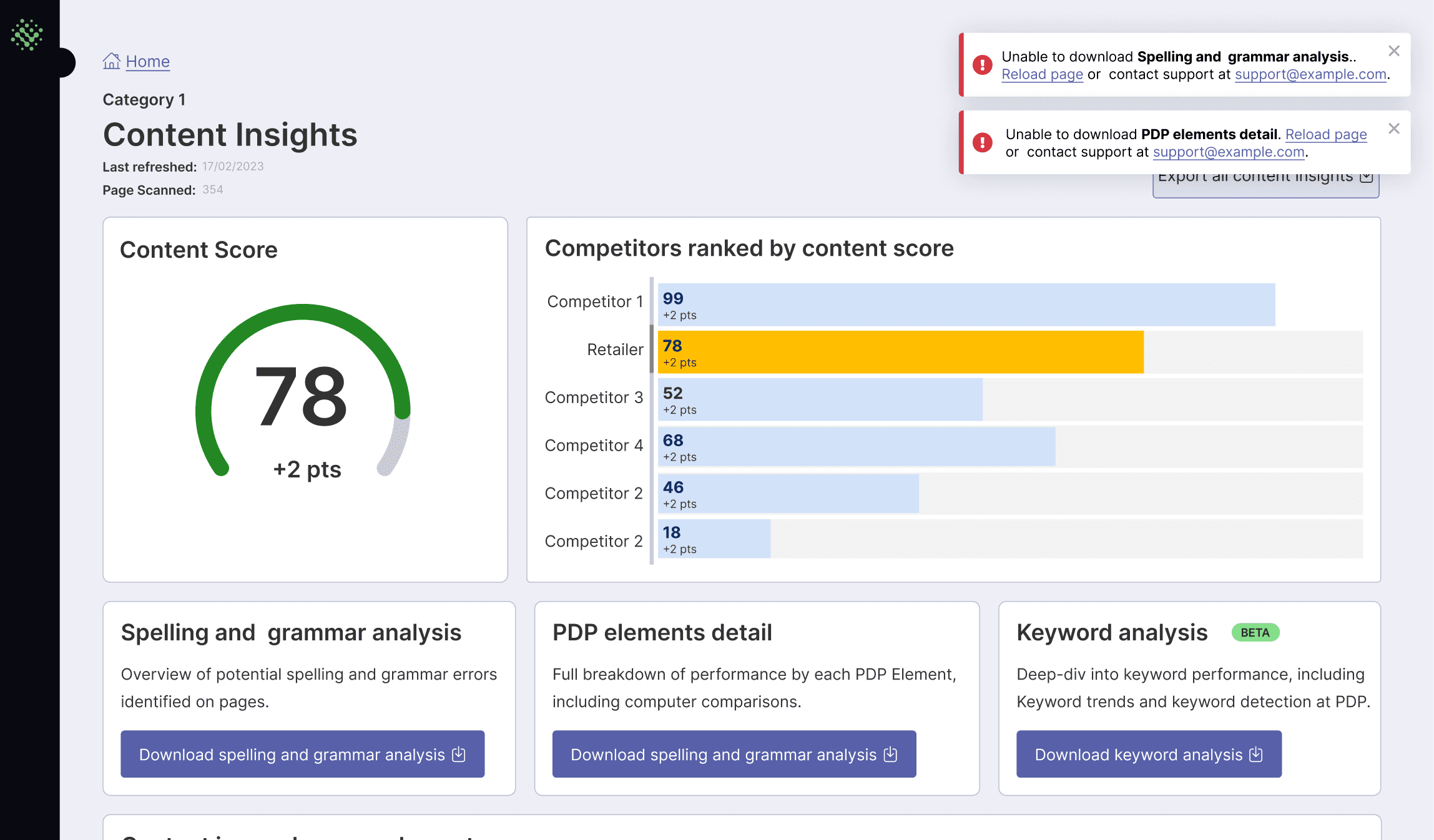
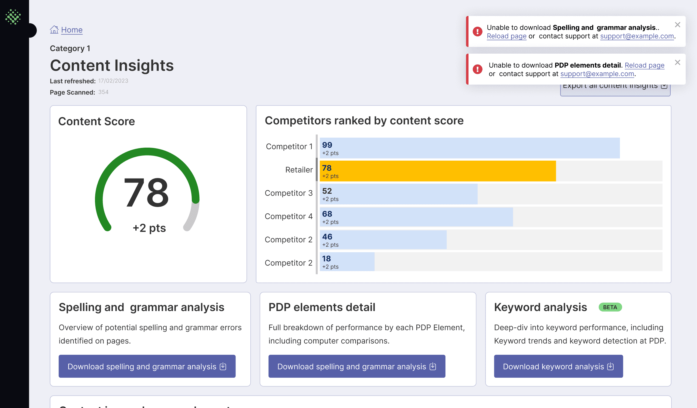
Component-Level Errors with Clear Communication
For component-level errors, I designed a user flow to handle missing data issues on the dashboard. When data was unavailable, users received an error message with options to reload the page or contact support.
After submitting a complaint, users received confirmation, and once the issue was resolved, they were notified by the support team. This approach ensured that users stayed informed and had clear steps to address the problem efficiently.


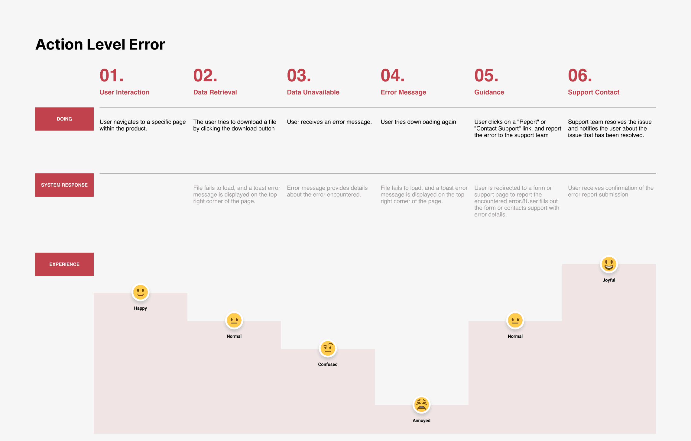
Action-Level Error
For action-level errors like failed file downloads, I designed a flow that keeps users informed and in control. When a download fails, users are prompted with an error message and options to re-download or contact support.
After submitting a complaint, users receive confirmation, and once the issue is resolved, they are notified by the support team. The user is then able to successfully re-download the file, ensuring a seamless recovery process.

Curating the Best Design Practices
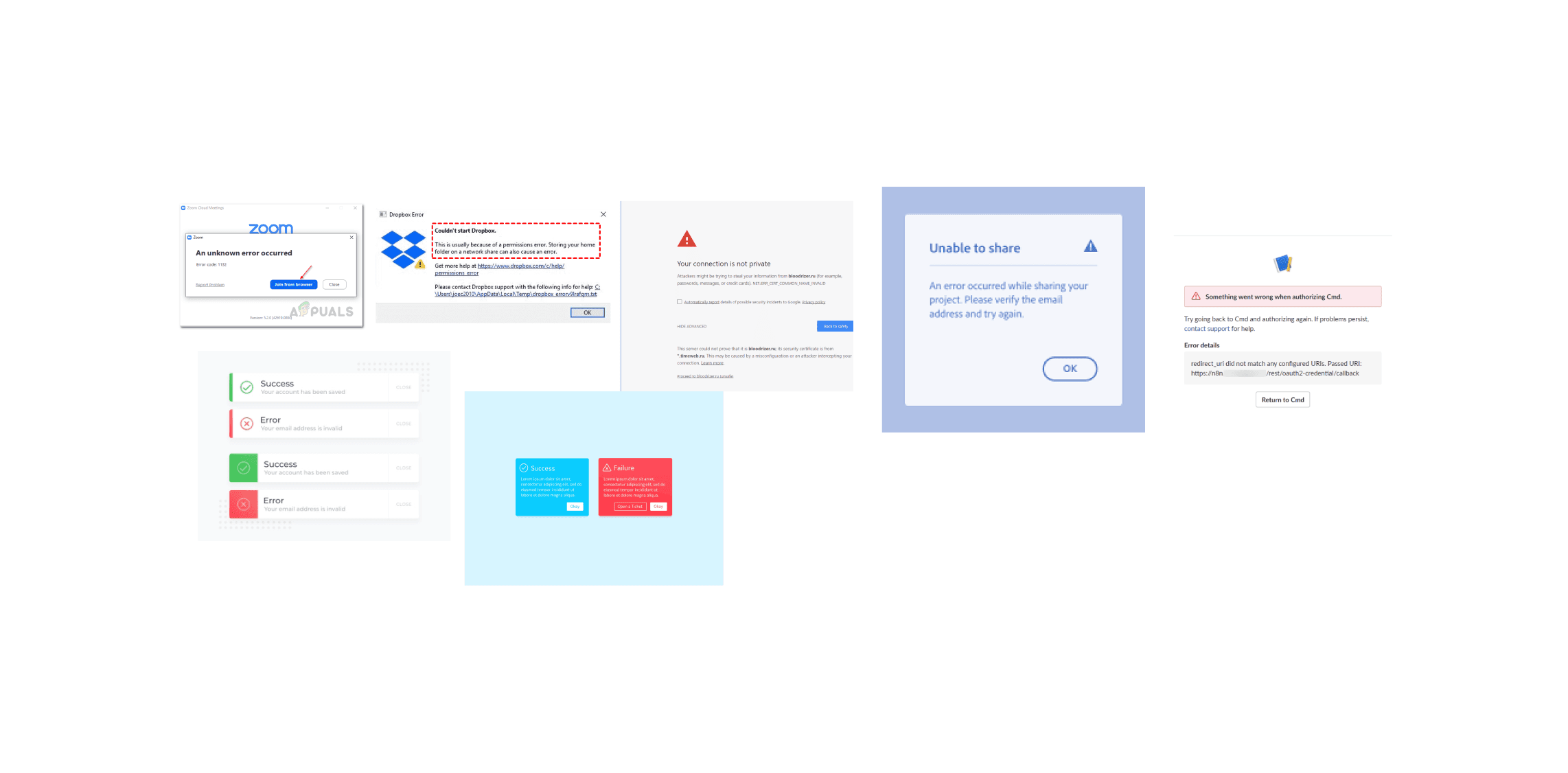
To inform and enhance my feedback state designs, I created a mood board featuring a variety of feedback systems from across the web. This research helped me identify effective visual patterns and interaction styles, guiding the development of intuitive, user-friendly feedback mechanisms. By analysing these examples, I was able to apply best practices to ensure my designs were both functional and engaging, providing users with clear, actionable information at every step.
WIREFRAME
Designing Clear, Actionable Feedback
For my solution, I focused on creating simple, specific, and helpful error messages. I ensured language was plain and free of technical jargon, with clear explanations of the issue and potential solutions. Each message was tailored to guide users with actionable next steps, and I used visuals and formatting to highlight important details.
I also incorporated support options and error codes for efficient troubleshooting. The goal was to make error handling as intuitive as possible, helping users resolve issues with minimal effort.

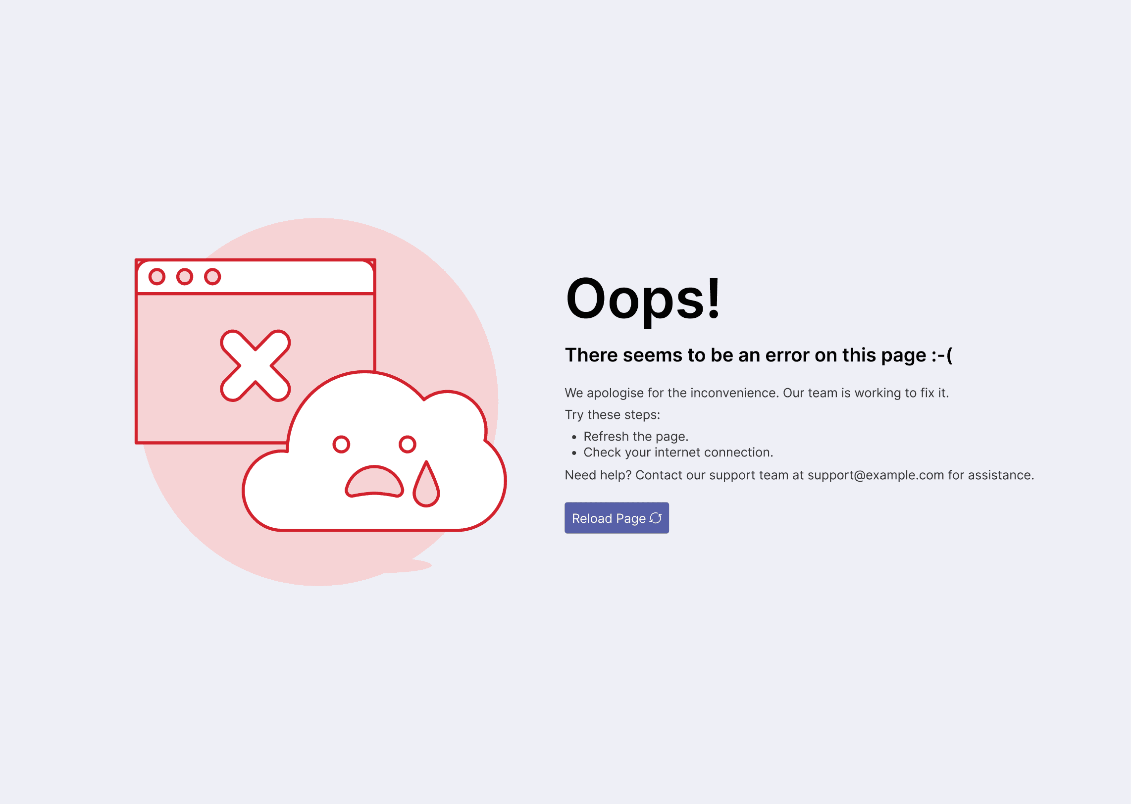
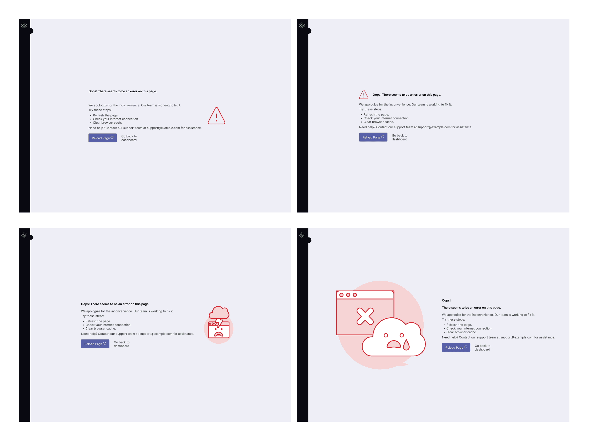
Designing the 404 Page: Clear, Engaging Error Recovery
For the app-level error, I designed a 404 page that provided users with a clear path forward when they encounter a broken link or missing page. The design featured a simple, friendly message with options to return to the homepage or contact support.
I created multiple variations of the page to explore different layouts and visual elements. After collaborating with the team, we selected the final design that best balanced usability and brand consistency, ensuring users could easily navigate away from the error without frustration.

Error Modals: Streamlining Page-Level Error Recovery
For page-level errors, I designed error modals that provided users with clear, actionable options when issues arose, such as page load failures. The modals featured concise error messages, along with prompts to either reload the page or contact support.
I focused on making these modals non-intrusive yet informative, allowing users to resolve issues quickly without disrupting their workflow. After testing multiple variations, I worked with the team to finalise a design that was both user-friendly and aligned with the overall product experience.

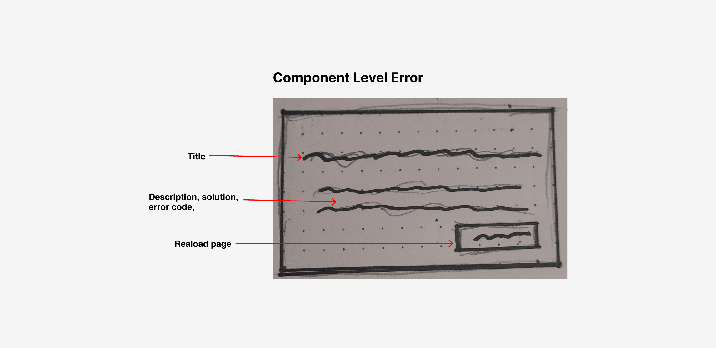
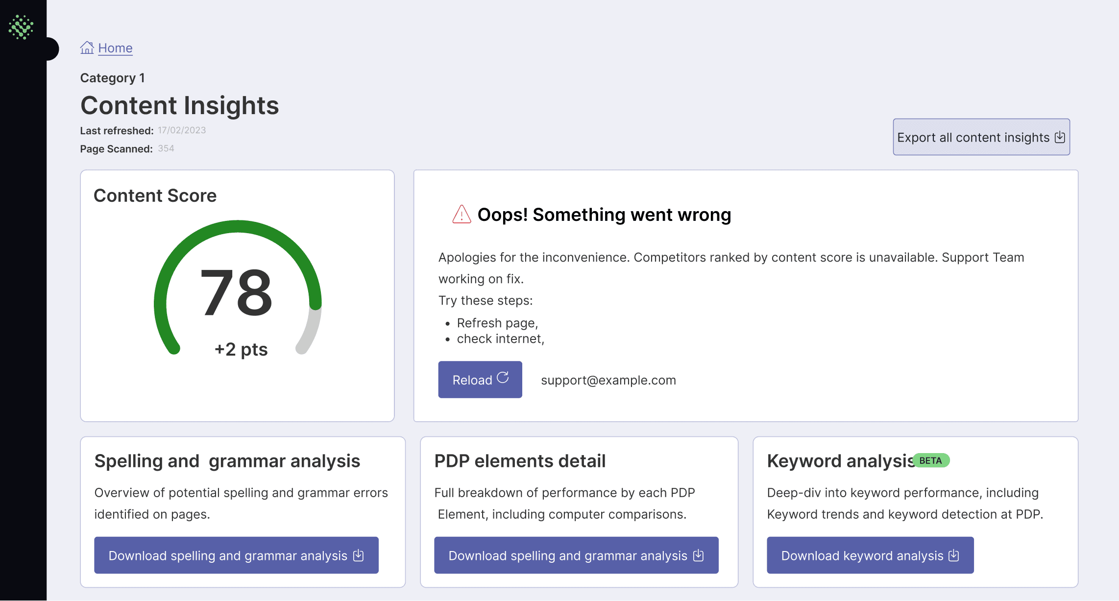
Addressing Component Failures
For component-level errors, such as when a specific feature like score analysis fails to load, I designed error components that clearly communicated the issue while guiding users toward solutions.
The error message, such as "Oops! Something went wrong," was paired with actionable steps like refreshing the page or checking the internet connection. I included a reload button for immediate action and a support link for further assistance. This design ensured users understood the problem and knew how to proceed, keeping their experience smooth even when components failed.
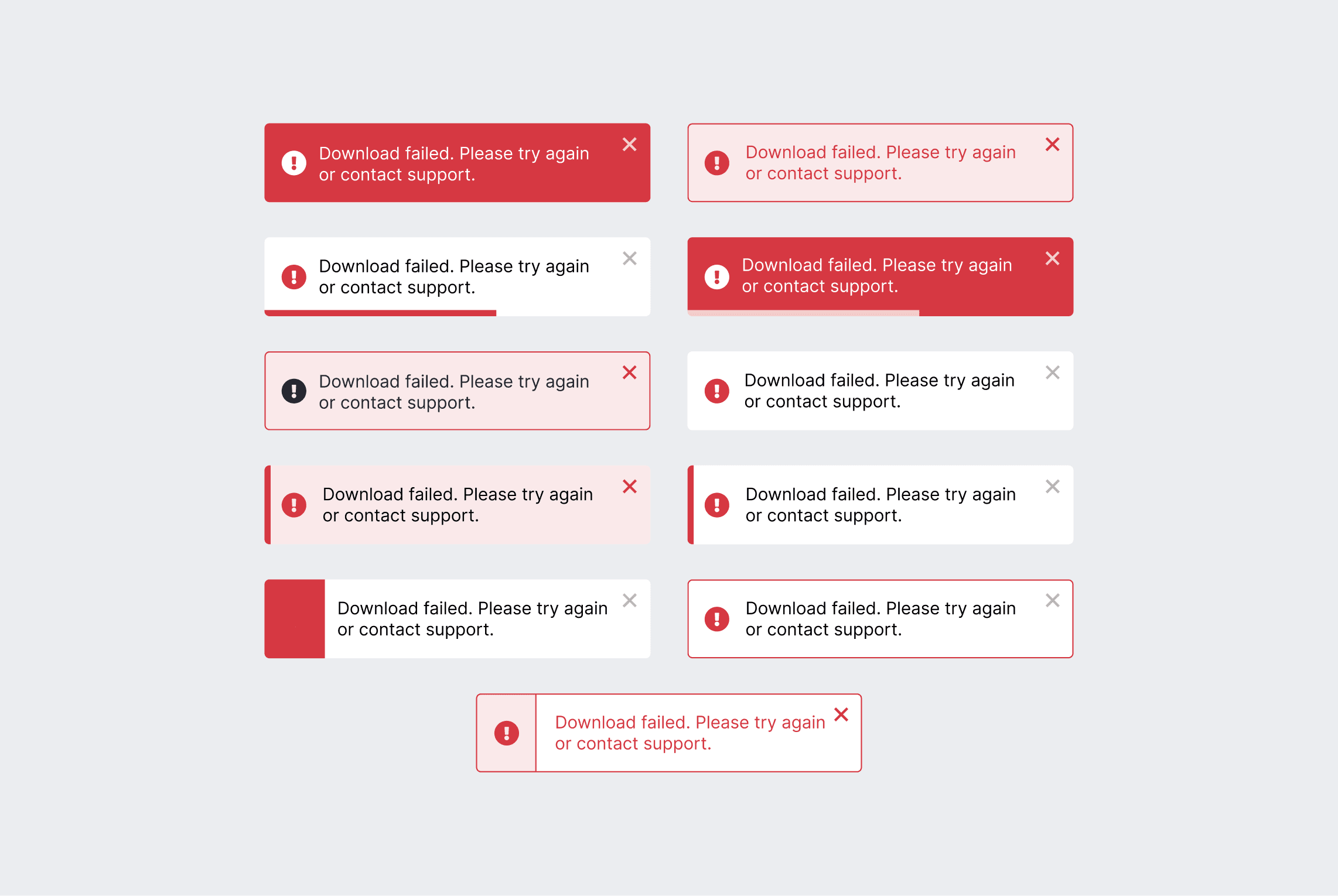
Designing Toast Notifications
For action-level errors, such as failed file downloads, I designed toast notifications to provide users with real-time, non-intrusive feedback. The notifications delivered clear messages about the error, along with options to retry the action or contact support.
I explored several design variations to ensure the notifications were visually appealing yet functional. After collaborating with the team, we selected the most effective variation that balanced clarity, urgency, and user experience, ensuring users could take swift action without interrupting their workflow.
EVALUATION
Impact
Reduced user frustration: Clear error messages and actionable feedback led to a 25% reduction in user complaints.
Improved task completion: Enhanced feedback states resulted in a 20% faster task completion rate.
Efficient support interactions: Actionable feedback reduced support inquiries by 30%, improving overall support team efficiency.
Takeaway
Iterative Process: Exploring multiple design variations and collaborating with the team led to the creation of optimal solutions.
Collaborative Effort: Close collaboration with the team ensured that the final designs were aligned with both technical feasibility and user experience goals.
Clear Communication: Emphasising clarity in error messages and instructions played a key role in reducing confusion and improving user confidence.